Call to Action Section
Overview
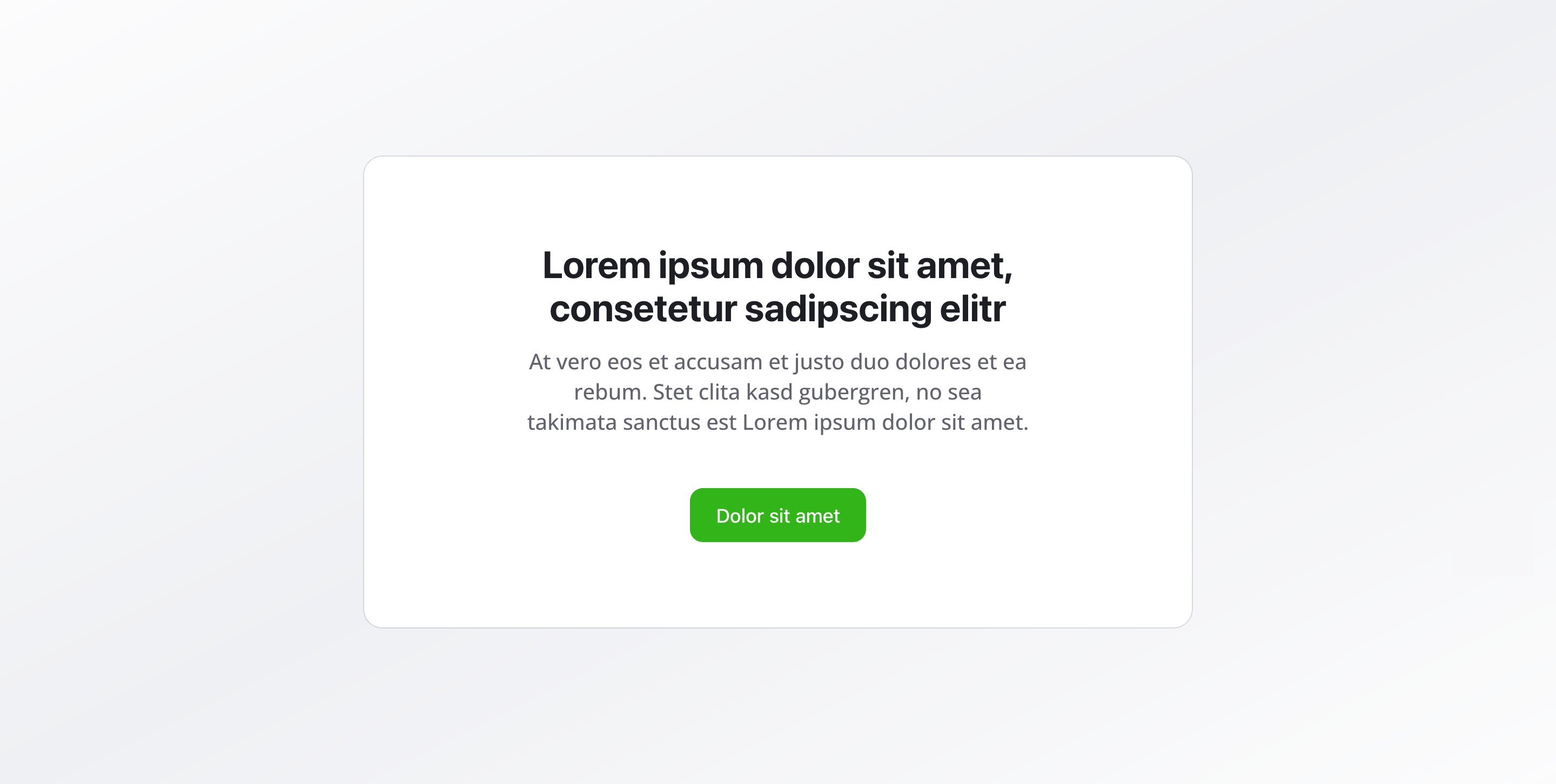
Section titled “Overview”The Call to Action Section is a focused content block that encourages visitors to take a specific action.
With a compelling headline, supporting description, and clear buttons, it guides users toward your primary goals — whether that’s signing up, contacting you, or downloading resources.
Fields
Section titled “Fields”Headline
Section titled “Headline”- Type: String
- Required: Yes
- Purpose: Main heading that captures attention and communicates the action
- Max Length: 100 characters
- Example:
Ready to get started?orStart your journey today
Description
Section titled “Description”- Type: Text
- Required: No
- Purpose: Supporting text that explains the value or benefit
- Max Length: 200 characters
- Example:
Sign up now and start your journey with experienced professionals and quality service.
Call to Action Buttons
Section titled “Call to Action Buttons”- Type: Reference (
button) - Required: No
- Purpose: Button configuration for the primary and secondary actions. You can configure primary and secondary buttons to guide users.
Background Color
Section titled “Background Color”- Type: Reference (
backgroundColor) - Required: No
- Purpose: Sets the background color for the entire section
Usage Example
Section titled “Usage Example”Typical Configuration
Section titled “Typical Configuration”- Headline:
Ready to get started? - Description:
Sign up now and start your journey with experienced professionals and quality service. - Call to Action Buttons:
- Primary Button:
Sign up now→/registration - Secondary Button:
Learn more→/about-us
- Primary Button:
Best Practices
Section titled “Best Practices”- Clarity: Use clear, action-oriented headlines that immediately communicate what you want users to do
- Motivation: The description should clearly communicate the benefit or value proposition
- Buttons: Use a primary button for the main action, with an optional secondary button for alternative actions
- Placement: Often placed at the end of pages or after important information to capture interest
- Background color: A distinctive background color can draw attention, but ensure sufficient contrast for readability
- Single focus: Keep the CTA focused on one primary action to avoid decision paralysis
Key Features
Section titled “Key Features”- Action-oriented design: Specifically designed to drive conversions and engagement
- Flexible buttons: Support for primary and secondary action buttons
- Clear messaging: Headline and description work together to communicate value
- Visual emphasis: Background color options help the section stand out
- Strategic placement: Works best when positioned after users have consumed relevant content
Where It’s Used
Section titled “Where It’s Used”- Pages (
page)
General content pages, especially at the end of sections - Landing Pages
Conversion-focused landing pages
Technical Notes
Section titled “Technical Notes”- Buttons reference the global
buttonschema for consistent styling - Background color references the global
backgroundColorschema - The section is optimized for conversion with clear visual hierarchy