Image Slider Section ONE
Overview
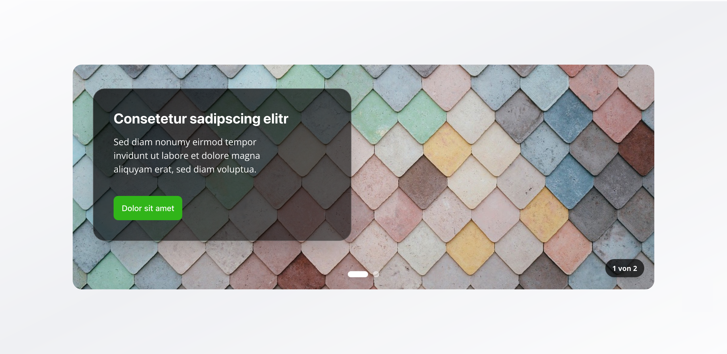
Section titled “Overview”The Image Slider Section is a flexible image slider that combines global content (shared across all slides) with slide-specific content. With autoplay functionality and extensive configuration options, it’s perfect for creating dynamic, engaging presentations.
Fields
Section titled “Fields”Global Slider Content
Section titled “Global Slider Content”Slider Title
Section titled “Slider Title”- Type: String
- Required: No
- Purpose: Title that appears on all slides
Slider Description
Section titled “Slider Description”- Type: Text
- Required: No
- Purpose: Brief description that appears on all slides
Show Call to Action Button
Section titled “Show Call to Action Button”- Type: Boolean
- Required: No
- Purpose: Toggle to display a call to action button on all slides
- Default Value:
false
Call to Action Button
Section titled “Call to Action Button”- Type: Object
- Required: No
- Purpose: Global CTA button configuration for all slides
- Note: Only visible when “Show Call to Action Button” is enabled
Each button includes:
Button Text (label)
Section titled “Button Text (label)”- Type: String
- Required: Yes
- Purpose: Text displayed on the button
Relative Link (link)
Section titled “Relative Link (link)”- Type: String
- Required: Yes
- Purpose: Relative path (e.g.,
/contact,/services) - Validation: Must start with
/ - Example:
/contactor/services
Content Alignment
Section titled “Content Alignment”- Type: String
- Required: No
- Purpose: Alignment of text content on slides
- Default Value:
left - Options:
left– Leftright– Right
Individual Slides Configuration
Section titled “Individual Slides Configuration”Slides
Section titled “Slides”- Type: Array of slider image objects
- Required: Yes
- Purpose: Configuration of individual slides
- Min Count: 1
- Max Count: 10
Each slide includes:
Slide Image
Section titled “Slide Image”- Type: Image
- Required: Yes
- Purpose: Main image for this slide
- Options: Hotspot enabled for optimal cropping and focal point control
Alt Text
Section titled “Alt Text”- Type: String
- Required: Yes
- Purpose: Descriptive text for screen readers and SEO
- Min Length: 1 character
- Max Length: 125 characters
Image Caption
Section titled “Image Caption”- Type: String
- Required: No
- Purpose: Short image caption
Enable Image Link
Section titled “Enable Image Link”- Type: Boolean
- Required: No
- Purpose: Toggle to make the entire image clickable
- Default Value:
false
Image Link
Section titled “Image Link”- Type: Object
- Required: No
- Purpose: Clickable link configuration for the entire image
- Note: Only visible when “Enable Image Link” is enabled
Each image link includes:
URL (url)
Section titled “URL (url)”- Type: URL
- Required: Yes
- Purpose: External link when clicking the image
- Note: Must be a full URL (e.g.,
https://example.com)
Open in New Tab (openInNewTab)
Section titled “Open in New Tab (openInNewTab)”- Type: Boolean
- Required: No
- Purpose: Open link in new tab
- Default Value:
false
Slide Headline
Section titled “Slide Headline”- Type: String
- Required: No
- Purpose: Custom headline for this slide (overrides global title)
Slide Description
Section titled “Slide Description”- Type: Text
- Required: No
- Purpose: Custom description for this slide (overrides global description)
Show Call to Action Button
Section titled “Show Call to Action Button”- Type: Boolean
- Required: No
- Purpose: Toggle to display a call to action button on this slide
- Default Value:
false
Call to Action Button
Section titled “Call to Action Button”- Type: Object
- Required: No
- Purpose: Slide-specific CTA button configuration
- Note: Only visible when “Show Call to Action Button” is enabled
Each button includes:
Button Text (label)
Section titled “Button Text (label)”- Type: String
- Required: Yes
- Purpose: Text displayed on the button
Relative Link (link)
Section titled “Relative Link (link)”- Type: String
- Required: Yes
- Purpose: Relative path (e.g.,
/contact,/services) - Validation: Must start with
/ - Example:
/contactor/services
Content Alignment
Section titled “Content Alignment”- Type: String
- Required: No
- Purpose: Alignment of text content on this slide
- Default Value:
left - Options:
left– Leftright– Right
Slider Behavior Settings
Section titled “Slider Behavior Settings”Enable Autoplay
Section titled “Enable Autoplay”- Type: Boolean
- Required: No
- Purpose: Automatically advance to the next slide
- Default Value:
true
Autoplay Speed
Section titled “Autoplay Speed”- Type: Number
- Required: No
- Purpose: Seconds between automatic slide transitions
- Default Value: 5
- Min Value: 1
- Max Value: 30
- Note: Only visible when “Enable Autoplay” is enabled
Show Navigation Dots
Section titled “Show Navigation Dots”- Type: Boolean
- Required: No
- Purpose: Display clickable dots below the slider for navigation
- Default Value:
true
Visual Settings
Section titled “Visual Settings”Slider Height
Section titled “Slider Height”- Type: String
- Required: No
- Purpose: Controls the height of the image slider
- Default Value:
large - Options:
small– Small (30vh)medium– Medium (50vh)large– Large (70vh)fullscreen– Fullscreen (100vh)custom– Custom Height
Custom Height
Section titled “Custom Height”- Type: String
- Required: No
- Purpose: Custom CSS height value (e.g., “400px”, “50vh”, “20rem”). Only used when height is set to “Custom Height”
- Note: Only visible when “Slider Height” is set to
custom - Validation: Must be a valid CSS height value (supports px, vh, vw, rem, em, %, or auto)
- Example:
400px,50vh, or20rem
Slider Width
Section titled “Slider Width”- Type: String
- Required: No
- Purpose: Controls the width of the image slider
- Default Value:
100% - Options:
100%– Full width50%– Half widthcustom– Custom Width
Custom Width
Section titled “Custom Width”- Type: String
- Required: No
- Purpose: Custom CSS width value (e.g., “400px”, “50vw”, “20rem”). Only used when width is set to “Custom Width”
- Note: Only visible when “Slider Width” is set to
custom - Validation: Must be a valid CSS width value
- Example:
400px,50vw, or20rem
Background Color
Section titled “Background Color”- Type: Reference (
backgroundColor) - Required: No
- Purpose: Sets the background color for the slider
Usage Example
Section titled “Usage Example”Typical Configuration
Section titled “Typical Configuration”- Slider Title:
Our Offers - Slider Description:
Discover our diverse service offerings - Show Call to Action Button:
false(ortruewith button configuration) - Content Alignment:
left - Slides:
- Slide 1: Image + “Premium Service Package” + Description
- Slide 2: Image + “Standard Service Package” + Description
- Slide 3: Image + “Express Service” + Description
- Enable Autoplay:
true - Autoplay Speed:
5seconds - Show Navigation Dots:
true - Slider Height:
large(70vh) - Slider Width:
100%
Best Practices
Section titled “Best Practices”- Slide count: 3-8 slides are optimal for engagement
- Alt text: Always fill in meaningful alt text (max 125 characters) for accessibility and SEO
- Autoplay speed: 5-7 seconds is a good balance between attention and information delivery
- Image quality: Use high-quality, consistent images
- Content alignment: Use consistent alignment for better readability
- Global vs. slide-specific: Use global content for consistency, slide-specific content for variety
Key Features
Section titled “Key Features”- Global and slide-specific content: Combination of global and individual content
- Clickable images: Entire images can be linked
- Flexible sizing: Various predefined heights or custom CSS values
- Autoplay: Automatic transitions with configurable speed
- Navigation: Clickable dots for direct navigation
- Responsive: Adapts to different screen sizes
Where It’s Used
Section titled “Where It’s Used”- Pages (
page)
General content pages, especially hero areas and product pages
Technical Notes
Section titled “Technical Notes”- Global content appears on all slides unless overridden by slide-specific content
- CTA buttons are configured inline (not as references) with required
label(button text) andlink(relative link) fields - Images can be made clickable by enabling the image link option
- Image links must be external URLs (full URL required, stored in
urlfield) - Alt text (
altfield) is required with minimum 1 character and maximum 125 characters for optimal SEO - Slide images support hotspot positioning for optimal cropping and focal point control
- Autoplay can be paused on user interaction
- Background color references the global
backgroundColorschema - Custom height and width accept any valid CSS value (px, vh, vw, rem, em, %, or auto)
- Custom height and width fields are validated to ensure proper CSS format
- The slider requires a minimum of 1 slide and supports up to 10 slides