Tabs Section
Overview
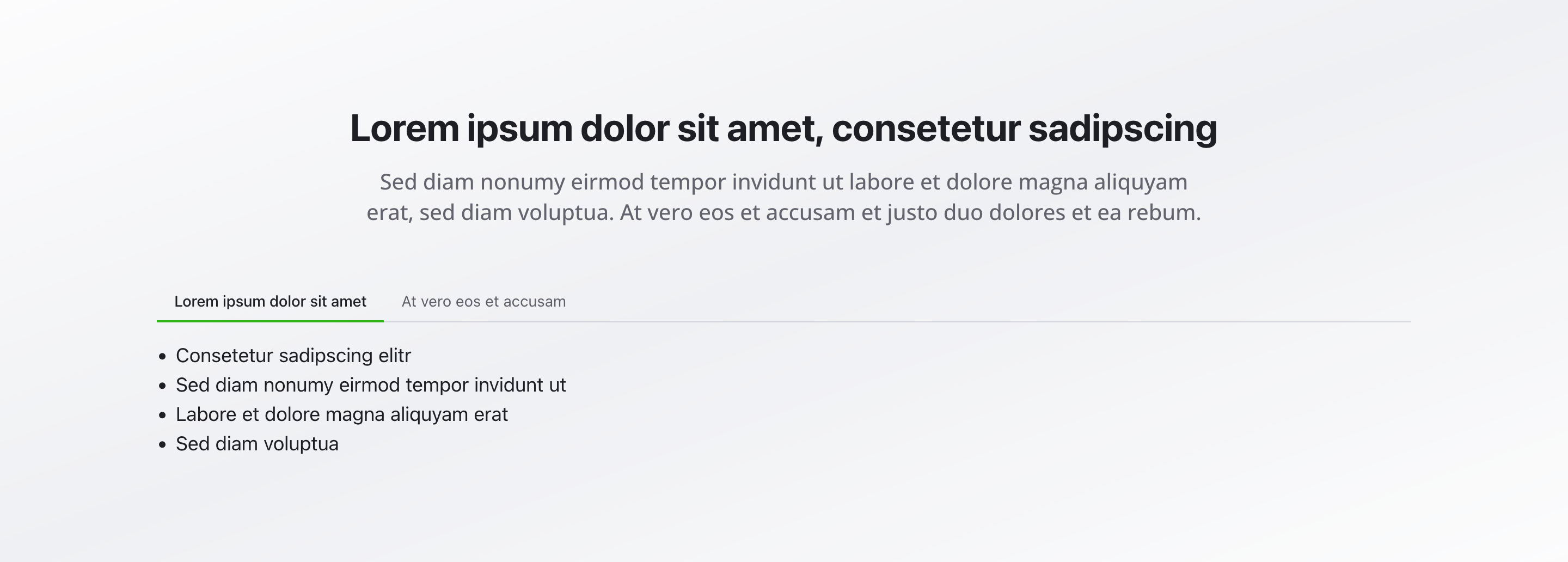
Section titled “Overview”The Tabs Section organizes content into different tabs using tab navigation. It’s perfect for structured, categorized information that benefits from a clear, organized presentation where only one section is visible at a time.
Fields
Section titled “Fields”Headline
Section titled “Headline”- Type: String
- Required: Yes
- Purpose: Main heading for the entire tabs section
- Example:
Our Service PackagesorService Options
Description
Section titled “Description”- Type: Text
- Required: No
- Purpose: Description for the tabs section
- Max Length: 500 characters
- Example:
Choose the right service package for your needs
- Type: Array of objects
- Required: Yes (minimum 1)
- Purpose: List of tab items displayed as tabs
Each tab item includes:
Item Headline
Section titled “Item Headline”- Type: String
- Required: Yes
- Purpose: Headline of the tab (displayed as tab label)
- Example:
Basic Package
Icon (mobile version only)
Section titled “Icon (mobile version only)”- Type: Lucide Icon
- Required: No
- Purpose: Optional icon (mobile version only)
- Source: Lucide icon library
- Examples: Package, Star, Crown, Building
Content
Section titled “Content”- Type: Rich Text Section (
richTextSection) - Required: Yes
- Purpose: Rich text content displayed in the active tab
- Note: Supports full formatting, images, links, etc.
Background Color
Section titled “Background Color”- Type: Reference (
backgroundColor) - Required: No
- Purpose: Sets the background color for the entire section
Usage Example
Section titled “Usage Example”Typical Configuration
Section titled “Typical Configuration”- Headline:
Our Service Packages - Description:
Choose the right service package for your needs - Items (Tabs):
- “Basic Package” (Package icon)
- Content: Details about the basic package with essential services
- “Standard Package” (Star icon)
- Content: Comprehensive services with additional features
- “Premium Package” (Crown icon)
- Content: Advanced solutions for businesses
- “Enterprise Package” (Building icon)
- Content: Full-scale solutions with dedicated support
- “Basic Package” (Package icon)
Best Practices
Section titled “Best Practices”- Headline: Use concise, meaningful headlines for each tab
- Categorization: Group related content logically in tabs
- Icons: Use icons consistently and only when they add value (mobile version only)
- Content length: Keep content per tab focused and balanced
- Count: 3-5 tabs are optimal for user experience
- Equivalence: Tabs should contain equivalent content
- Background color: Use background colors sparingly to ensure readability
Key Features
Section titled “Key Features”- Tab navigation: Organized content display with tab switching
- Rich text content: Full formatting capabilities within each tab
- Optional icons: Visual support for mobile version only
- Structured display: Ideal for categorized, equivalent content
- Space-efficient: Layout through tab navigation
- Interactive: Users can switch between tabs
- Accessible: Keyboard navigation support
Where It’s Used
Section titled “Where It’s Used”- Pages (
page)
General content pages, especially service and product pages
Technical Notes
Section titled “Technical Notes”- Only one tab is active at a time
- Content uses the
richTextSectiontype for full formatting capabilities - Icons (mobile version only) come from the Lucide icon library
- Background color references the global
backgroundColorschema - The section supports keyboard navigation for accessibility
Differences from Other Content Blocks
Section titled “Differences from Other Content Blocks”| Feature | Tabs Section | Accordion Section |
|---|---|---|
| Structure | Fixed (Tabs) | Fixed (Accordion) |
| Navigation | Tab navigation | Expandable |
| Visibility | One tab active | Multiple expandable |
| Rich Text | Yes (per tab) | Yes (per item) |
| Icons | No | Yes (optional) |
| Headlines | Yes (per tab) | Yes (per item) |
| Space-efficient | Yes | Yes |
| Usage | Categorized info | Structured info |
When to Use Tabs vs. Accordion
Section titled “When to Use Tabs vs. Accordion”Use Tabs Section when:
Section titled “Use Tabs Section when:”- Content is equivalent and categorized
- Only one area should be visible at a time
- Content belongs together thematically
- Clear navigation is important
Use Accordion Section when:
Section titled “Use Accordion Section when:”- Content is hierarchically structured
- Multiple areas can be visible simultaneously
- Content varies in length
- Expandable areas are preferred