Feature Section
This content is for v1.0. Switch to the latest version for up-to-date documentation.
Overview
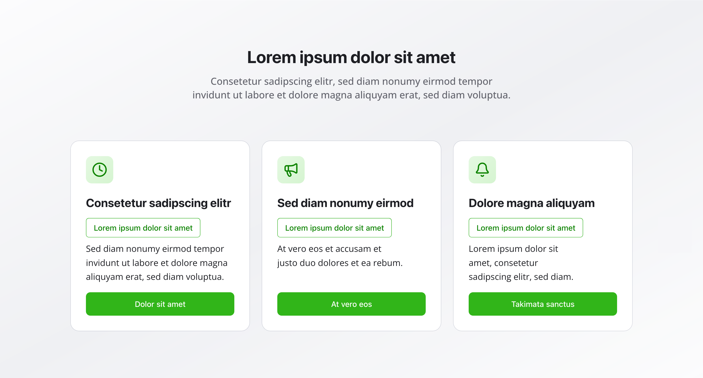
Section titled “Overview”The Feature Section lets you showcase your key features, benefits, or services in an organized, visually appealing format. Each feature can include an icon, headline, subheadline, description, and optional call-to-action button—perfect for highlighting what makes your offering unique.
Fields
Section titled “Fields”Active
Section titled “Active”- Type: Boolean
- Required: No
- Default Value:
true - Purpose: Controls whether the feature section is displayed on the website
- Note: Turn this off when you want the section hidden temporarily without removing its configuration
Headline
Section titled “Headline”- Type: String
- Required: No
- Purpose: Main heading for the entire feature section
- Examples:
Our Advantages,Why Choose Us
Description
Section titled “Description”- Type: Text
- Required: No
- Purpose: Description for the feature section
- Example:
Why you should choose us
Features
Section titled “Features”- Type: Array of feature objects
- Required: No
- Purpose: List of features to display
Feature Object Fields
Section titled “Feature Object Fields”Headline
- Type: String
- Required: No
- Purpose: The main title for this feature
- Example:
Expert Team
Subheadline
- Type: String
- Required: No
- Purpose: A secondary title or tagline
- Example:
Industry-leading expertise
Description
- Type: Text
- Required: No
- Purpose: Detailed description of the feature
- Example:
Our team brings years of expertise and knowledge...
Icon
- Type: Icon reference (Lucide)
- Required: No
- Purpose: A Lucide icon displayed with the feature
- Examples:
UserCheck,Zap,Calendar
Show Button
- Type: Boolean
- Required: No
- Default Value:
false - Purpose: Flag to show or hide the call-to-action button for this feature
CTA Button (Call to Action Button)
- Type: Reference (
ctaButtonItem) - Required: No
- Purpose: Call-to-action button configuration for this feature (label, link, role)
- Note: Only visible when “Show Button” is set to
true
Background Color
Section titled “Background Color”- Type: Reference (
backgroundColor) - Required: No
- Purpose: Sets the background color for the entire feature section
Usage Example
Section titled “Usage Example”Typical Configuration
Section titled “Typical Configuration”- Headline:
Our Advantages - Description:
Why you should choose us - Features:
- “Expert Team” (UserCheck icon)
- Subheadline:
Industry-leading expertise - Description:
Our team brings years of expertise and knowledge... - Show Button:
true - CTA Button:
{ label: "Learn more", link: "/about-us" }
- Subheadline:
- “Modern Technology” (Zap icon)
- Subheadline:
Cutting-edge solutions - Description:
Built with the latest technology and innovation... - Show Button:
true - CTA Button:
{ label: "View products", link: "/products" }
- Subheadline:
- “Flexible Options” (Calendar icon)
- Subheadline:
Available 24/7 - Description:
We offer flexible solutions that adapt to your needs... - Show Button:
true - CTA Button:
{ label: "Get started", link: "/get-started" }
- Subheadline:
- “Expert Team” (UserCheck icon)
Best Practices
Section titled “Best Practices”- Consistency: Use similar structures for all features to create visual harmony.
- Icons: Use icons consistently and appropriately—they should add clarity, not just decoration.
- Clarity: Keep headlines and subheadlines short and impactful.
- Count: 3-6 features work best for optimal user experience.
- Buttons: Use CTA buttons sparingly, only when they add value.
- Focus: Each feature should communicate a single, clear benefit.
Key Features
Section titled “Key Features”- Visual organization: Features displayed in a clean, organized layout
- Icon support: Lucide icons add visual interest and clarity
- Flexible content: Headlines, subheadlines, and descriptions for comprehensive information
- Call-to-action: Optional buttons for each feature to drive engagement
- Customizable: Background color and layout options for brand consistency
Where It’s Used
Section titled “Where It’s Used”- Pages (
page)
General content pages, especially homepages and service pages
Technical Notes
Section titled “Technical Notes”- Icons come from the Lucide icon library
- CTA buttons use the global
ctaButtonItemschema (label, link, role) - Background color references the global
backgroundColorschema - Features are typically displayed in a grid layout that adapts to screen size
- Each feature has a
_keyfield (internal Sanity identifier)