Team Section
This content is for v1.0. Switch to the latest version for up-to-date documentation.
Overview
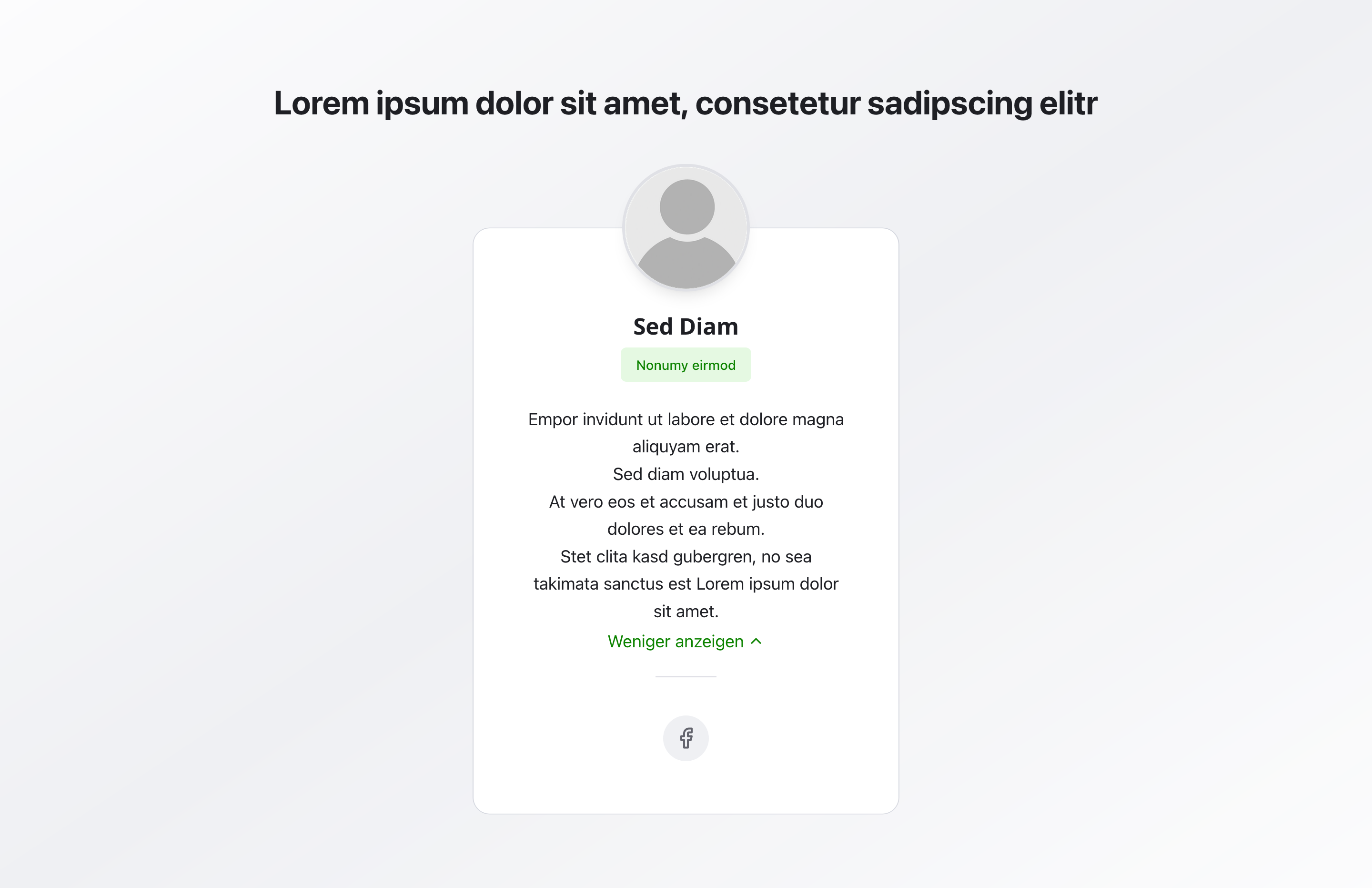
Section titled “Overview”The Team Section displays all team members in organized cards. Each card shows a photo, name, role, bio, and optional social media links—perfect for introducing your team and building personal connections with visitors.
Fields
Section titled “Fields”Active
Section titled “Active”- Type: Boolean
- Required: No (default: active)
- Purpose: Controls whether the entire team section is displayed on the website.
- Note: Disable this field if the section should be prepared but not live yet.
Headline
Section titled “Headline”- Type: String
- Required: No
- Purpose: Main heading displayed above the team cards
- Example:
Our TeamorMeet the Team - Note: Keep it short—one sentence or maximum 2 lines
Description
Section titled “Description”- Type: Text
- Required: No
- Purpose: Introductory text below the headline that briefly explains the team section.
- Example:
Get to know the people behind our services. - Note: Keep the text compact (1–3 sentences) to explain the section without overloading the cards.
Members
Section titled “Members”- Type: Array of team member objects
- Required: No
- Purpose: List of team members—each entry corresponds to one team card on the website
- Note: One card = one person or system (e.g., simulator). In most cases, 3–8 team members are optimal.
Each team member includes:
- Type: String
- Required: Yes
- Purpose: Displayed as bold heading on the card
- Example:
Max Mustermann
- Type: String
- Required: No
- Purpose: Displayed as colored label under the name
- Example:
Project Manager,Business Advisor, orTechnical Specialist - Note: Keep it short and clear
- Type: Rich text
- Required: No
- Purpose: Text in the main area of the card
- Note: Can contain multiple lines. Longer texts may be truncated with “Show more”. Use bullet points or short sentences; we recommend a maximum of 5–7 lines.
- Rich text options: Supports formatting, images, videos, and image sliders as described in the
Rich Textblock documentation.
- Type: Image
- Required: No
- Purpose: Round profile picture displayed above the card
- Note: Should be standalone and well-lit. Consistent style for all team members, face clearly visible
Show Social Links
Section titled “Show Social Links”- Type: Boolean
- Required: No
- Purpose: Toggle to display social media icons below the card
- Default Value:
false - Note: Only enable when the person should be publicly contactable and social media is maintained
Social Links
Section titled “Social Links”- Type: Social links section
- Required: No
- Purpose: Configuration of social media links for this team member
- Note: Only visible when “Show Social Links” is enabled. Internally it uses the same fields as the
Social Media Linksblock (section headline, description, social links list, alignment, and icon size). For details, see theSocial Media Linksdocumentation.
When social links are enabled, you can configure, among other things:
- Section headline and section description (optional)
- Social links (platform, URL, label, optional custom icon)
- Alignment (left, center, right)
- Icon size (small, medium, large)
Background Color
Section titled “Background Color”- Type: Reference (
backgroundColor) - Required: No
- Purpose: Sets the background color for the entire section
- Note: Does not affect individual cards
Usage Example
Section titled “Usage Example”Typical Configuration
Section titled “Typical Configuration”- Headline:
Our Team - Members:
- Name:
Max Mustermann- Role:
Project Manager - Bio: Team leader, process coordinator, client relations specialist
- Photo: Profile photo
- Show Social Links:
true - Social Links: Instagram, LinkedIn
- Role:
- Name:
Best Practices
Section titled “Best Practices”- Team size: 3-8 team members are optimal
- Consistent imagery: Use uniform photo style for all team members
- Roles: Keep roles short and clear
- Bios: Keep text personal but professional
- Social links: Only enable when profiles are actively maintained
- Photo quality: Use high-quality, consistent photos with good lighting
Common Mistakes to Avoid
Section titled “Common Mistakes to Avoid”- Long texts: Avoid very long texts without paragraphs
- Inconsistent photos: Don’t use different photo formats or styles
- Empty roles: Always fill in role fields
- Unmaintained social links: Don’t enable social links without active profiles
Key Features
Section titled “Key Features”- Organized cards: Team members displayed in clean, organized cards
- Photo support: Round profile pictures for each member
- Social integration: Optional social media links for each member
- Flexible content: Name, role, and bio for comprehensive information
- Responsive: Adapts to different screen sizes
Where It’s Used
Section titled “Where It’s Used”- Pages
General content pages, especially about-us pages
Technical Notes
Section titled “Technical Notes”- The entire section can be toggled on or off via the
Activefield - Photos are displayed as round images
- Social links use platform-specific icons and share the same options (alignment, icon size, platform selection) as the
Social Media Linksblock - Bio text may be truncated with “Show more” for longer content
- Background color references the global
backgroundColorschema - Cards are displayed in a responsive grid layout