Hero Section ONE
This content is for v1.0. Switch to the latest version for up-to-date documentation.
Overview
Section titled “Overview”The Hero Section ONE is a flexible and visually rich hero area designed to create strong first impressions.
It supports multi-part headlines with different styles, colored keywords for emphasis, and call-to-action buttons to guide user interaction.
Fields
Section titled “Fields”Headline
Section titled “Headline”- Type: Object
- Required: Yes
- Purpose: The headline is composed of multiple parts, each with its own visual style. This allows you to emphasize specific words or phrases while keeping the headline readable and dynamic.
Headline Parts
Section titled “Headline Parts”- Type: Array of objects
- Required: Yes (minimum 1)
- Purpose: Each part represents a segment of the headline
Each headline part includes:
- Type: String
- Required: Yes
- Purpose: Text content of the headline part
- Example:
Welcome to the
- Type: String
- Required: Yes
- Purpose: Visual appearance of the text
- Options:
Normal– Default text styleHighlighted (Background)– Text with colored backgroundColored Text– Colored text without background
Background Color
Section titled “Background Color”- Type: String
- Required: No
- Purpose: Background color behind the text
- Note: Only visible when Style is
Highlighted (Background) - Options:
Green (default), Orange, Purple, Blue, Red, Pink, Yellow, Gray, Black
Text Color
Section titled “Text Color”- Type: String
- Required: No
- Purpose: Text color on the background (when highlighted) or color of the text itself (when colored text)
- Note: Visible when Style is
Highlighted (Background)orColored Text - Options:
- Highlighted: Black (default), White
- Colored Text: Green (default), Orange, Purple, Blue, Red, Pink, Yellow, Gray, Black
Keywords
Section titled “Keywords”- Type: Array of objects
- Required: No
- Purpose: Keywords appear below the headline and can each have their own color for additional emphasis (e.g. electric, digital, modern)
Each keyword includes:
Keyword Text
Section titled “Keyword Text”- Type: String
- Required: Yes
- Purpose: Text displayed as a keyword
- Type: String
- Required: No
- Purpose: Color of the keyword
- Options:
Green (default), Orange, Purple, Blue, Red, Pink, Yellow, Gray, Black
Subheadline
Section titled “Subheadline”- Type: Text
- Required: No
- Purpose: Supporting text displayed below the headline to add context or explain the value proposition
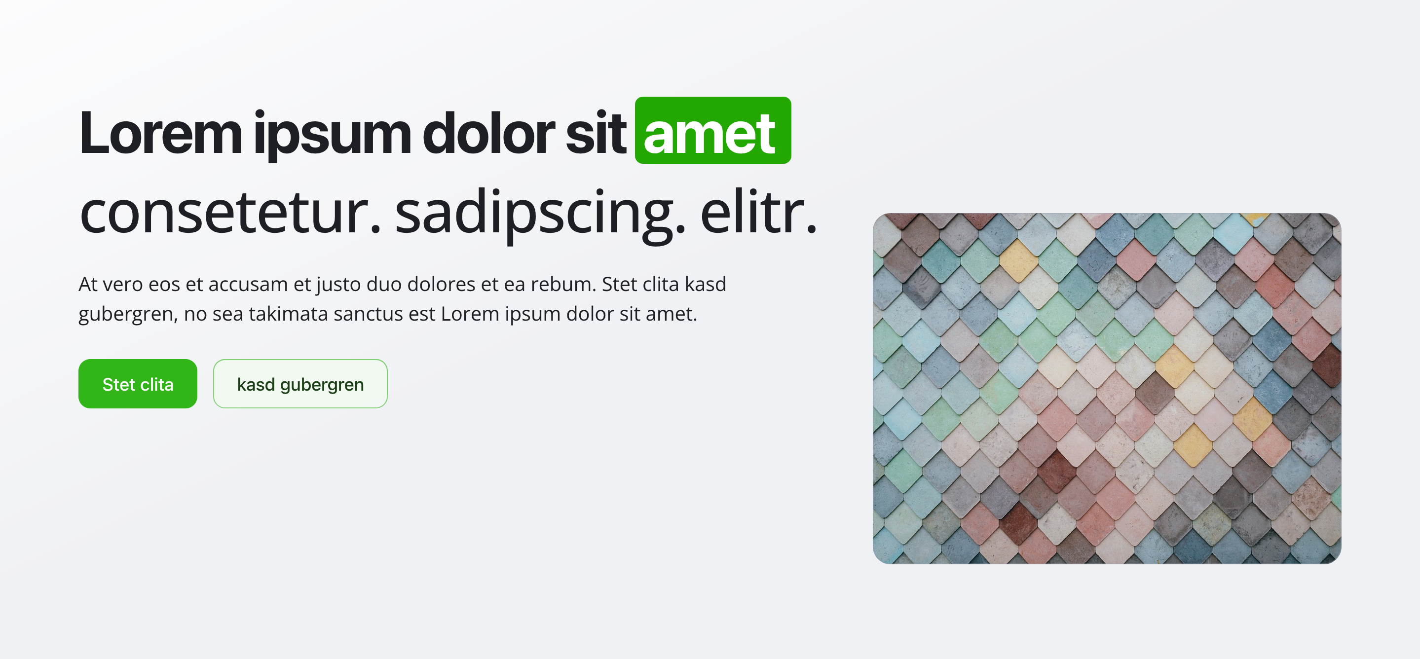
Background Image
Section titled “Background Image”- Type: Image
- Required: Yes
- Purpose: The background image of the hero section
- Note: Hotspot positioning is enabled for optimal cropping and focal point control
Call to Action Buttons
Section titled “Call to Action Buttons”- Type: Array of objects
- Required: No
- Purpose: Buttons that encourage user interaction
- Validation rules:
- Maximum one Primary button
- Maximum one Secondary button
- All button fields are required
Each button includes:
Button Text
Section titled “Button Text”- Type: String
- Required: Yes
- Purpose: Label shown on the button
Relative Link
Section titled “Relative Link”- Type: String
- Required: Yes
- Purpose: Target URL
- Format: Must start with
/ - Example:
/speed-coursesor/contact
Button Role
Section titled “Button Role”- Type: String
- Required: Yes
- Purpose: Visual importance of the button
- Options:
Primary– Main call to actionSecondary– Secondary action
Usage Example
Section titled “Usage Example”Typical Configuration
Section titled “Typical Configuration”- Headline Parts:
- “Welcome to the” – Style: Normal
- “modern” – Style: Highlighted, Background: Green, Text Color: Black
- “experience” – Style: Normal
- Keywords:
innovative(Green)digital(Blue)sustainable(Green)
- Subheadline:
Discover our comprehensive solutions designed to help you achieve your goals with cutting-edge technology and expert support. - Background Image: A professional brand-related image (required)
- Call to Action Buttons:
- Primary: Sign up now →
/registration - Secondary: Learn more →
/about-us
- Primary: Sign up now →
Best Practices
Section titled “Best Practices”- Headline: Keep it short and impactful. Use highlights sparingly.
- Style mix: Combine normal, highlighted, and colored text for visual rhythm.
- Keywords: Use 2–4 keywords and keep colors consistent with your brand.
- Subheadline: Add clarity without repeating the headline.
- Buttons: Use clear, action-oriented language.
- Background image: Choose high-quality images that work well with text overlays.
- Color coordination: Ensure sufficient contrast and brand consistency.
Key Features
Section titled “Key Features”- Flexible headline system: Multi-part headline with different styles
- Visual emphasis: Highlighted backgrounds and colored text options
- Conditional fields: Fields appear dynamically based on selected styles
- Colored keywords: Individually colored keywords for emphasis
- Button validation: One Primary and one Secondary button maximum
- Background image: Required background image with hotspot support
- Accessibility: Clear visual hierarchy and accessibility-friendly markup
Where It’s Used
Section titled “Where It’s Used”- Pages (
page)
Homepages and landing pages
Technical Notes
Section titled “Technical Notes”- Headline is built from an array of styled parts
- Supported headline styles:
- Normal
- Highlighted (background + text color)
- Colored text
- Color options:
- 9 background colors
- 9 text colors
- Keywords are separate from the headline and fully customizable
- Button links must be relative paths starting with
/ - All button fields are mandatory
- Uses semantic HTML for accessibility
- Conditional fields appear dynamically based on selected styles