Image Slider Section TWO
This content is for v1.0. Switch to the latest version for up-to-date documentation.
Overview
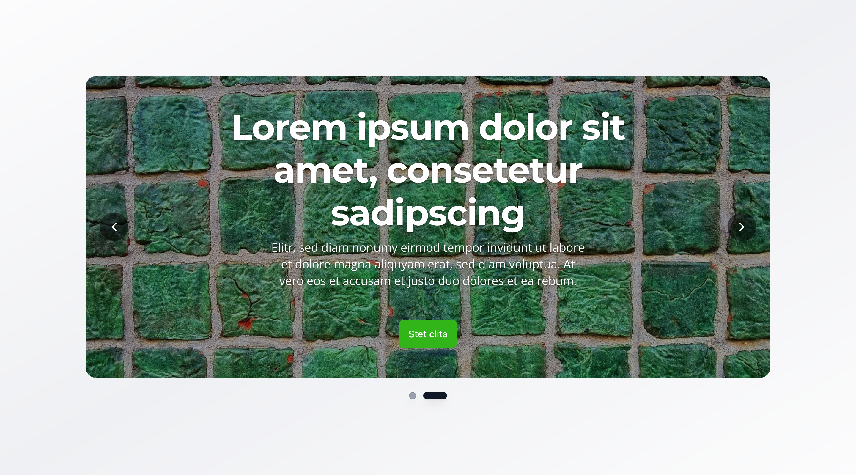
Section titled “Overview”The Image Slider Section TWO is a carousel-based image slider that supports multiple slides with images, text, and call-to-action buttons. It’s ideal for pages that want to present multiple messages or offers, rotating through different content automatically or manually.
Fields
Section titled “Fields”Slides
Section titled “Slides”- Type: Array of slide objects
- Required: Yes
- Purpose: Configuration of slides for the image slider
- Min Count: 1
- Max Count: 10
Each slide includes:
Slide Image
Section titled “Slide Image”- Type: Image
- Required: Yes
- Purpose: Main image for this slide
- Options: Hotspot enabled for optimal cropping and focal point control
- Type: String
- Required: Yes
- Purpose: Heading displayed on the slide
- Max Length: 100 characters
Description
Section titled “Description”- Type: Text
- Required: Yes
- Rows: 3
- Purpose: Description text displayed on the slide
- Max Length: 300 characters
Show Call to Action Button
Section titled “Show Call to Action Button”- Type: Boolean
- Required: No
- Purpose: Toggle to display a call to action button on this slide
- Default Value:
false
Call to Action Button
Section titled “Call to Action Button”- Type: Object
- Required: No
- Purpose: Button configuration for the slide
- Note: Only visible when “Show Call to Action Button” is enabled
Each button includes:
Button Text (label)
Section titled “Button Text (label)”- Type: String
- Required: Yes
- Purpose: Text displayed on the button
Relative Link (link)
Section titled “Relative Link (link)”- Type: String
- Required: Yes
- Purpose: Relative path (e.g.,
/contact,/services) - Validation: Must start with
/ - Example:
/contactor/services
Slider Behavior
Section titled “Slider Behavior”Enable Autoplay
Section titled “Enable Autoplay”- Type: Boolean
- Required: No
- Purpose: Automatically advance to the next slide
- Default Value:
true
Autoplay Speed
Section titled “Autoplay Speed”- Type: Number
- Required: No
- Purpose: Seconds between automatic slide transitions (1-30 seconds)
- Default Value: 5
- Min Value: 1
- Max Value: 30
- Note: Only visible when “Enable Autoplay” is enabled
Show Navigation Dots
Section titled “Show Navigation Dots”- Type: Boolean
- Required: No
- Purpose: Display clickable dots below the slider for navigation
- Default Value:
true
Visual Settings
Section titled “Visual Settings”Slider Height
Section titled “Slider Height”- Type: String
- Required: No
- Purpose: Controls the height of the slider
- Default Value:
large - Options:
small– Small (30vh)medium– Medium (50vh)large– Large (70vh)fullscreen– Fullscreen (100vh)custom– Custom Height
Custom Height
Section titled “Custom Height”- Type: String
- Required: No
- Purpose: Custom CSS height value (e.g., “400px”, “50vh”, “20rem”). Only used when height is set to “Custom Height”
- Note: Only visible when “Slider Height” is set to
custom - Validation: Must be a valid CSS height value (supports px, vh, vw, rem, em, %, or auto)
- Example:
400px,50vh, or20rem
Slider Width
Section titled “Slider Width”- Type: String
- Required: No
- Purpose: Controls the width of the image slider
- Default Value:
100% - Options:
100%– Full width50%– Half widthcustom– Custom Width
Custom Width
Section titled “Custom Width”- Type: String
- Required: No
- Purpose: Custom CSS width value (e.g., “400px”, “50vw”, “20rem”). Only used when width is set to “Custom Width”
- Note: Only visible when “Slider Width” is set to
custom - Validation: Must be a valid CSS width value
- Example:
400px,50vw, or20rem
Background Color
Section titled “Background Color”- Type: Reference (
backgroundColor) - Required: No
- Purpose: Sets the background color for the slider
Usage Example
Section titled “Usage Example”Typical Configuration
Section titled “Typical Configuration”- Slides:
- Slide 1:
- Image: Modern office or facility
- Title:
Professional Services - Description: Professional services with modern solutions and experienced team members
- Show Call to Action Button:
true - Call to Action Button: “Sign up now” →
/registration
- Slide 2:
- Image: Product or service
- Title:
Sustainable Solutions - Description: Discover our eco-friendly and sustainable solutions
- Show Call to Action Button:
true - Call to Action Button: “Learn more” →
/solutions
- Slide 3:
- Image: Team or group
- Title:
Premium Packages - Description: Get results quickly with our proven premium packages
- Show Call to Action Button:
true - Call to Action Button: “View packages” →
/packages
- Slide 1:
- Enable Autoplay:
true - Autoplay Speed:
5seconds - Show Navigation Dots:
true - Slider Height:
large(70vh) - Slider Width:
100% - Background Color: Reference to a
backgroundColorobject
Best Practices
Section titled “Best Practices”- Slide count: 3-5 slides are optimal for user experience—too few doesn’t justify a carousel, too many can overwhelm
- Slide content: Each slide should have a clear, focused message
- Images: Use high-quality, meaningful images that support the message
- Text lengths: Keep titles short (max 100 characters), descriptions concise (max 300 characters)
- Autoplay speed: 5-7 seconds is a good balance between attention and information delivery
- Navigation: Enable navigation dots for better usability
- Height: “Large” (70vh) is optimal for most cases; use “Fullscreen” sparingly
Key Features
Section titled “Key Features”- Carousel functionality: Supports 1-10 slides with automatic or manual navigation
- Flexible sizing: Various predefined heights or custom CSS values
- Autoplay: Automatic slide transitions with configurable speed
- Navigation: Clickable dots for direct navigation to a specific slide
- Hotspot images: Slide images support hotspot function for better image editing
- Responsive: Adapts to different screen sizes
Where It’s Used
Section titled “Where It’s Used”- Pages (
page)
General content pages, especially when multiple offers or messages need to be showcased
Technical Notes
Section titled “Technical Notes”- Slides are displayed in order, with the first slide shown initially
- CTA buttons are configured inline (not as references) with required
label(button text) andlink(relative link) fields - Navigation dots indicate the current slide
- Background color references the global
backgroundColorschema - Custom height and width accept any valid CSS value (px, vh, vw, rem, em, %, or auto)
- Custom height and width fields are validated to ensure proper CSS format
- The slider requires a minimum of 1 slide and supports up to 10 slides
Differences from Image Slider Section ONE
Section titled “Differences from Image Slider Section ONE”| Feature | Image Slider Section ONE | Image Slider Section TWO |
|---|---|---|
| Global Content | Yes (Title, Description, CTA, Alignment) | No |
| Global CTA Button | Yes (optional) | No |
| Global Content Alignment | Yes (Left/Right) | No |
| Slide-Specific CTA | Yes (optional, per slide) | Yes (optional, per slide) |
| Slide Content Alignment | Yes (optional, per slide) | No |
| Slide Headlines | Optional (overrides global title) | Required (max 100 characters) |
| Slide Descriptions | Optional (overrides global description) | Required (max 300 characters, 3 rows) |
| Image Links | Yes (clickable images with URL) | No |
| Image Captions | Yes (optional) | No |
| Alt Text | Required (min 1, max 125 characters) | Required (same) |
| Slide Count | 1-10 slides (minimum 1) | 1-10 slides (minimum 1) |
| Structure | Global + slide-specific content | Slide-only content |
| Use Case | Content with shared global elements | Independent slide content |
| Complexity | More flexible, supports global defaults | Simpler, slide-focused |